1.Types of Charts
Different chart types can help you analyze price action, the three most commonly used being:
-
Bar Chart
-
Line Chart
-
Candlestick Chart
Bar Chart
This chart type is made up of vertical bars each showing the open, close, high and low of prices. Each vertical bar represents the range of each time period. The top of the vertical bar indicates the highest price while the bottom of the bar represents the lowest price at that particular time. The opening price is shown by the tic to the left of the bar and the closing price is the tic on the right.
Line Chart
The line chart connects all the closing prices with a line, which shows the general price movement.
Candlestick Chart
The candlestick chart is very popular amongst traders because it shows a lot of information regarding price. From this type of chart we can obtain the open, close, high and low of prices, just like in a bar chart.
The difference between a candlestick chart and a bar chart is that visually, candlestick charts are easier to use when trading and performing technical analysis. The reason is because candlesticks are good at identifying market turning points. We are able to identify swing highs and swing lows. For example, they show reversals from an uptrend to a downtrend or a downtrend to an uptrend. Also, the candlesticks sometimes form a certain formation like a shooting start and a doji, which also help us identify a possible trend reversal. We will learn more about this later.
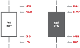
The Body of a Candle
The candles on the chart have what is called a body. This body shows us the open and close prices. If the body has a wick, (sometimes called a shadow), then these wicks record the highs and lows of the price at a particular time. Each candlestick represents the range of the time period. When candlestick charts were first developed by the Japanese in the 1600’s, they used black and white candles.
A white candle means that the closing price was higher than the opening price during that time period represented by the candle. A black candle shows the opposite, meaning the closing price was lower than the opening price. The shadow on the top of the body of the candle represents the highest price traded during the time period and the shadow below the candle represents the lowest price.
2. Trend and Patterns
Before you start trading, you need to identify the trend of the market.
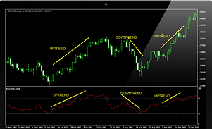
This involves finding the general direction of price movement. We can observe on any chart and in any time frame that markets do not move in a continuous straight line but instead create a series of peaks and troughs. By studying the direction of these tops and bottoms, we can see whether the trend is up, down or in a range.
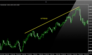
When price action creates higher successive peaks and higher successive bottoms, then we can say the trend is up.
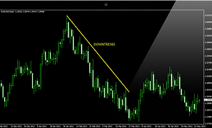
On the other hand, when lower and lower peaks are formed, along with successive lower troughs, we can say the trend is down.
When price action moves sideways to create horizontal peaks and troughs, the trend is said to be in a range.
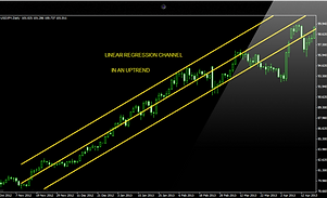
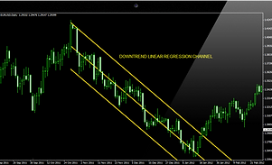
The channel is a variation of the trend line technique. Prices trend between two parallel lines – the trend line and the channel line. The longer the channel remains intact and the more often it is successfully tested, the more important and reliable it become. The longer the channel line remains intact, meaning the longer the price action remains within the channel, then the stronger the trend will be.
Support and Resistance
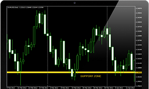
The market does not move in a continuous straight line but rather in a zigzag pattern, creating peaks and troughs. Hence, price action results in the formation of various levels which provide a cushion or support when prices fall, or create a ceiling or resistance when prices rise. These levels are appropriately called support and resistance levels. Prices usually bounce off these levels each time to create new peaks and troughs.
What Creates Support and Resistance Levels?
Support is the price level at which demand (buying power) is strong enough to prevent the price from declining further. So when prices fall to a certain level, the prices are cheap enough that it results in many buyers entering the market. This eventually lifts prices higher, causing the market to bounce back up. Resistance is the price level at which supply (selling power) is strong enough to prevent the price from rising further. The logic behind this is that as prices become more expensive, more sellers enter the market to take advantage of these high prices and make a profit. This results in prices eventually falling, until they reach a certain support level.
Reversal Patterns
A reversal pattern is a transitional phase that marks the turning point between a rising and a falling market. If prices have been advancing, the enthusiasm of buyers has outweighed the pessimism of sellers up to this point, and prices have risen accordingly. During the transition phase, the balance becomes more or less even until finally, for one reason or another, it is tipped in a new direction as the relative weight of selling pushes the trend down. At the termination of a falling market, the reverse process occurs.
Imagine a fast moving train, which takes a long time to slow down and then goes into reverse. The same is normally true of financial markets!
The most important reversal patterns are:
-
Head and Shoulders & Inverse Head and Shoulders
-
Double Tops and Bottoms
-
Triple Tops and Bottoms
-
Spike (V)
-
Rounding (or saucer) Bottom
Head and Shoulders
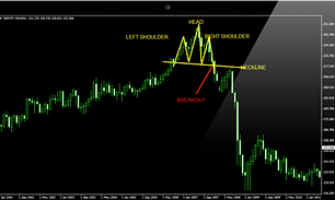
The head and shoulders pattern is one of the most famous and most recognizable of all reversal patterns. It must be noted that there must be an existing prior trend to reverse in order for the pattern to be valid.
Referring to the chart above, we can see a head and shoulders pattern. Prior to this pattern there was an uptrend. Prices are rallying higher with greater momentum to create the highest peak which is called the head. The lower peaks on either side of the head are called shoulders. A neckline is drawn by connecting the lowest points of the two troughs on either side of the head.
As prices breakout and fall below the neckline at the right shoulder, this signifies a reversal in the prior trend. A downtrend now takes place.In this chart formation, a sell position can be entered at the breakout point below the neckline.
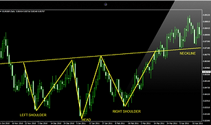
Inverse Head and Shoulders
The inverse head and shoulders patternworks the same way as a normal head and shoulders pattern, the only difference is that the head is upside down!
By looking at the chart, we can see that there was a downtrend, with the head making the lowest low. Prices subsequently failed to make a lower low, hence we have the right shoulder. Then prices penetrated the neckline, to reverse to an uptrend. Notice how prices found support at the neckline level. A buy position could be entered at the break out point from the neckline.
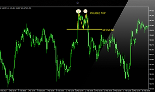
Double Tops
The double top pattern is another type of reversal pattern which has two peaks at about the same level. These are the highest peaks reached after an uptrend, where prices find strong resistance. Double top patterns signal a reversal from an uptrend to a downtrend.When prices are rallying higher in an uptrend, they reach the first top (peak) then retrace slightly to find a support level before bouncing back up.Prices are unable to rise higher than the first peak and find strong resistance at the price level reached by the first peak. Subsequently prices fall back down. After testing the resistance level for the second time, prices fall back down and penetrate the neckline. This is when we have the double top pattern and the reversal in the trend is confirmed.
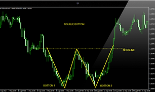
Double Bottoms
The double bottoms chart pattern is a reversal pattern that signals a change in price direction. It is basically the opposite of a double top reversal pattern. This pattern signals the reversal of a downtrend into an uptrend.The image below demonstrates clearly that a double bottom pattern is easily recognizable since it looks like the letter “W”A double bottom pattern usually forms in a situation when sellers are battling against buyers but sellers eventually fail to be in control. More buyers enter the market and push prices higher.During a downtrend prices are reaching new lows until they find support which prevents prices from falling further. This creates the first bottom which is the lowest level. Prices soon bounce off support and retrace up to a resistance level. When prices fail to break resistance, there will be another sell off to the previous low. The re-test of the support forms the double bottom on the chart pattern. Subsequently prices climb higher after failing to break support. The double bottom formation is completed when prices break above the neckline (resistance level).
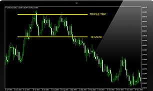
Triple Tops
The triple top chart pattern is similar to the double top. It is also a bearish reversal pattern with the difference being that there are three “tops”, as the name suggests.All three tops should be approximately at an equal level. It does not have to be exact, but very close. These three highs create a “resistance” level. Hence, prices rally to this level and test it three times. Prices are unable to break resistance and eventually reverse direction and the trend becomes a down trend.During the formation of the pattern, a support level was also formed, which prices bounced off when attempting to rally but met resistance and fell back down to this support level. The triple top reversal is completed only until this support level is broken to the downside. This confirms the reversal of the prior uptrend. Upon breaking the support line, this is a good opportunity to enter a short position.
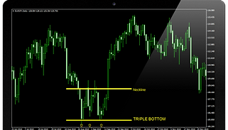
Triple Bottoms
The triple bottom chart formation is the exact opposite of the triple top pattern. It is a bullish reversal pattern, meaning it shows the reversal of the prior downtrend to an uptrend.During the formation of the pattern, prices which are in a downtrend reach a strong support level which they attempt to break three times. This results in the formation of three troughs, or bottoms, hence giving the name triple bottom.These three troughs are at around the same level and form the support line. Each time prices attempt to break the support line, they bounce back up to the resistance line. Once prices breakout from this resistance line to the upside, the pattern is complete and the trend is confirmed to have reversed.
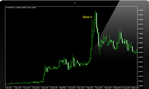
Spike (V) Reversal Pattern
Most spike reversal patterns (also called V-Reversal patterns) are formed after a sharp previous trend. Prices reverse direction without giving any signals and as such this is known as the market turning on a dime. This situation is difficult to trade and it is best to stay out of the market.Sometimes when a spike occurs the only recourse we may have is to check oscillators that show if the market was over-extended.
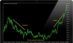
Rounding Bottom
The rounding bottom (saucer) pattern is another type of reversal pattern. Unlike the spike reversal pattern, it takes longer to form and prices change direction very gradually. Saucers are usually spotted on weekly or monthly charts that span several years.
Continuation Patterns
Continuation chart patterns are formations that show sideways price action.Unlike reversal patterns which indicate a change in the trend, continuation patterns actually show that there is a temporary pause in the trend where prices consolidate after a big move. After such a huge price rally, buyers usually take a pause to “catch their breath” before continuing their previous actions. Likewise, after a big drop in prices, sellers will pause, often closing existing short positions to take profits before continuing to sell again. Due to these actions, prices consolidate during traders’ pauses and end up forming certain patterns. The formation of the continuation patterns is said to be complete after prices break out and continue in the direction of the prevailing trend.
The most common continuation patterns are:
-
Triangles
-
Wedges
-
Pennants
-
Flags
-
Rectangles
Triangles and wedges are intermediate term continuation patterns whereas flags and pennants are short term patterns.
Triangles
There are three main types of triangles:
-
Symmetrical
-
Ascending
-
Descending
The ascending triangle is bullish whereas the descending triangle is bearish. The symmetrical triangle is a neutral pattern.
Triangle patterns usually have a minimum of four to six reversal points which are required to form the shape of the actual triangle. The more times the triangle is tested the more durable it becomes and the stronger the breakout will be. The formation usually lasts about one to three months long.
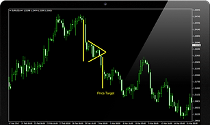
Symmetrical Triangle
In the symmetrical triangle formation, prices consolidate in such a way that the slope (trendline) connecting the highs and the slope (trendline) connecting the lows converge together to look like a triangle.
If the prior trend was down, then prices will eventually break out of the triangle and continue the down trend. If there was an uptrend before the triangle formation, then prices will eventually break out to continue higher.
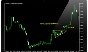
Ascending Triangle
In the ascending triangle formation, the upper trend line is flat, while the lower line is rising. This occurs because buyers are more aggressive than sellers. It is therefore a bullish continuation pattern which is completed when prices breakout to the upside.
It is important that the price closes above the flat upper line in order for the pattern to be complete and to be called an ascending triangle. We can see this in the chart below. Prices then resume the uptrend.
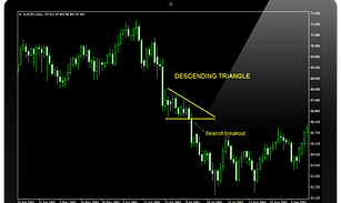
Descending Triangle
The descending triangle is basically a mirror image of the ascending triangle. In this case, the upper trend line has a downward slope while the lower line is just horizontal. This occurs because the sellers are more aggressive than buyers. Therefore, it is a bearish continuation pattern which is completed when prices breakout to the downside.
It is essential for you to know that the price closes below the flat lower line in order for the pattern to be completed and to be called an ascending triangle. We can see this in the chart below. Prices then resume the downtrend.
Wedges
Wedges are another form of continuation pattern since they also signal a pause in the current trend. They are somewhat similar to triangles since they are identified by two converging trend lines.The difference with triangles though is that wedges have a noticeable slant against the prevailing trend. Triangles usually have a more horizontal direction. As a continuation pattern, a falling wedge in an uptrend is considered bullish.
.
A rising wedge is bearish.
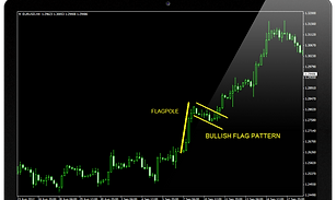
Pennants and Flags
Pennants and flags are another form of continuation pattern but are usually brief in duration in comparison to triangles and wedges. It usually takes less than a month for the pattern to be completed.
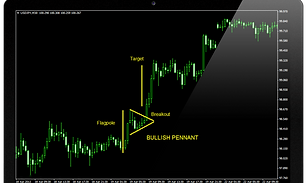
Pennant
A pennant is usually preceded by a strong move in prices, almost in a straight line, to resemble a flag pole or mast. Usually, pennants are said to be flying at half-mast. This is because pennants usually appear at about the halfway point of the whole move. So the distance of the initial price move is approximately the same as the proceeding price move after the breakout. Often we can use the height of this flagpole (i.e. the initial move) to estimate the size of the breakout move.
We distinguish bullish and bearish pennants.
The bullish pennant signals a bullish price move. Therefore, after a sharp rally, a bullish pennant forms as prices take a breather before running off again in the same upward direction. You can see the strength in the uptrend slows down as the pattern forms but then prices breakout and resume stronger upward momentum.
The bearish pennant signifies a bullish price move. Therefore, after a big fall, the bearish pennant provides a temporary pause in the downtrend for prices to consolidate and sellers to take profits. Prices soon breakout of the pennant and continue downward. In the chart below we can see a bearish pennant.
Flags
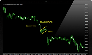
Flags are similar to channels. This continuation pattern consists of two parallel lines, acting as support and resistance. The slope of the lines can be either positive, negative or zero. This depends on the prevailing trend.
-
If the trend is up, the flag will point down and have a negative slope.
-
If the trend is down, the flag will point up, and have a positive slope.
The flag can sometimes just be sideways, and this is usually called a rectangle. Therefore, we could say that generally in a flag formation, the price will trend in a modest reversal, confined within the flag’s top and bottom trend lines, before breaking out in the same direction of the larger move that preceded the flag.
Below is an example of a bearish flag. You can notice how the price fell going into the flag and penetrated the upper flag line (resistance line). Also, the price fell going out of the bottom line (support line) of the flag. Therefore, this is a bearish sign that the price will fall upon breaking out of the bottom of the flag formation.
Below we have a chart with a bullish flag pattern.
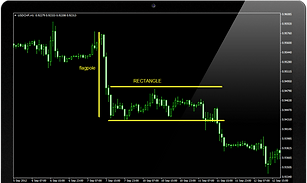
Rectangles
A rectangle is another type of continuation pattern. Just like the name implies, it takes the form of two parallel lines where prices are consolidating into a trading range. Therefore, this shows that the market is taking a pause from the previous trend and will likely continue in the same direction of the trend once the price breaks out of the rectangle.This rectangle formation is usually preceded by a flagpole, which can be used as a measuring target of when price will break out from the rectangle. Below is an example of a continuation pattern in the form of a rectangle. Prices were in an uptrend before consolidating into a rectangle. The price soon broke out above the upper parallel line of the rectangle to resume the uptrend.
3.Technical Indicators
Moving Averages
The moving average is one of the most popular indicators used in chart analysis and its main purpose is to identify the direction of a trend and also define potential support and resistance levels.
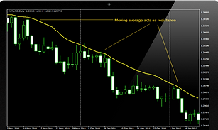
In the chart below we can see the moving average shows price direction is down and acts as resistance to prices in this downtrend.
The moving average is considered to be a lagging indicator. It does not predict price direction, but rather defines the current trend with a lag.
The moving average indicator filters out noise by smoothing out price and volume fluctuations that can confuse interpretation and it therefore makes it easier to view the underlying trend. It appears as a line on a chart close to price action and it shows the average value of a security’s price over a set period of time. For example, to calculate a 21-day moving average, the closing prices of the last 21 days are added up and the total is divided by 21. We perform the same calculation with each new trading day forward. Each time, only the prices of the last 21 days are used in the calculation. This is why it is called a moving average. The example we have just explained refers to the simple moving average (SMA). There are other types of moving average as well, such as the exponential and the weighted moving averages.
The problem with the simple moving average is that only the period covered by the average is considered and each day is given equal weight. So in a 21 day moving average, the 1st day carries equal weight to the 21st day. This is the main criticism of the simple moving average and some believe that more weight should be given to the more recent price action. To overcome this issue, the weighted moving average (WMA) can be used. The weighted moving average assigns more weight to recent prices and less weight to older prices.However, the weighted moving average takes into account the prices covered by the period of the moving average and not all the data in the life of the security. In order to solve this problem, the exponential moving average (EMA) can be used. This moving average assigns more weight on the recent prices and also includes all the price action in the history of the security. The advantage of this is that the exponential moving average is more sensitive and moves closer to the price action while at the same time takes into account its calculation of all the data in life of the security.
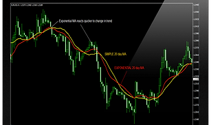
Looking at the diagram, we can see how the EMA reacts quicker to a change in the trend compared to the slower SMA.
What is the correct length of a moving average?
The critical element in a moving average is the number of time periods used in calculating the average. The length of a moving average should fit the market cycle you wish to follow.
TrendMoving Average Length
Short Term5-14 periods
Medium Term20-30
Long Term50-100
Very Long Term200
Do not use in a range! Moving averages work better when the market is trending. In a range this indicator is not of much use and buy or sell signals will not work effectively.
We can use moving averages to identify buy and sell opportunities. There are various techniques used. One is a simple technique using just one moving average. Other techniques use more than one moving average. The double crossover method, uses two moving averages, while the triple crossover method uses three moving averages. The advantage of using more than one moving average is that fewer whipsaws are produced.


Momentum Indicators
Indicators such as the Moving averages are not useful in trading ranges. What you could use instead are oscillators. These are said to be leading indicators, as opposed to lagging indicators, which is what moving averages are, as they tend to lag the trend. Oscillators lead price action and can give warning of an impending change in price direction, especially when there is a divergence. Unlike moving averages, which are plotted on the charts, oscillators are plotted below the price chart.
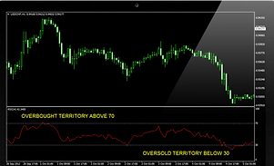
Most oscillators look alike and are interpreted in a similar way. Oscillator indicators are bound within a range, usually between zero and 100. This range is divided into and upper and lower halves by a mid-point line (which is sometimes zero, depending on the formula used to construct the oscillator).
Remember that oscillators are secondary indicators and should not be used exclusively but should be supported by using other indicators as well. You should always look at prices on the chart first, and whether the overall trend supports the idea.
Loss of Momentum
Oscillators can be used to indicate loss of momentum in the price move (trend).
Determining Extremes
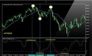
Oscillators are a good tool for determining overbought or oversold conditions and give us a warning that the price trend is overextended and vulnerable. An oscillator will fluctuate between these two extremes of overbought and oversold.
Why so? Because markets are essentially driven by psychological forces and investors’ emotions change from greed to fear, to hope, and to despair. This is what causes momentum indicators to oscillate from overbought to oversold conditions. We can say that the market is overbought when the oscillator is at an extreme in the upper half of the range. Oversold is when the oscillator is in the lower extreme.
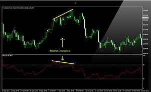
Divergence
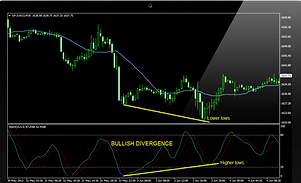
We can use oscillators to spot any divergence from price direction. This is an important warning that the price trend could change. Divergence only applies when the market is overextended (overbought or oversold). When in an extreme position, and the oscillator is in the opposite direction from price direction, this is called divergence. In the chart below we can see that even though prices are still rising, the oscillator here (RSI) is beginning to decline, causing a bearish (negative) divergence. This gives a warning that the trend could turn down.
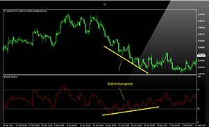
When the oscillator starts to turn back up while the prices are still declining, this is bullish (positive) divergence.
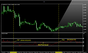
Crossing the Mid-point (or Zero) Line
Another use of the oscillator is when it crosses the middle line (or zero line) which separates the upper and lower half of the range, and to use it as a buy or sell signal.
Look at the chart below at the first red line. We sell when the oscillator crosses below the mid-point and prices are in a downtrend. On the other hand, buy when the oscillator crosses the mid-point from below and moves above while prices are in an existing uptrend.
An oscillator cannot just by itself be used to make a decision to enter a trade. It is a secondary indicator. Price always rules and the underlying trend is more important.
Look for overextended conditions, as this is usually where the oscillator is most useful. Consequently, especially look for divergence in extreme conditions – for example, prices going up and making new highs but oscillator turning down. Then also look for a mid-point or zero line crossing, as it may be a signal to buy or sell. Buy when above the line and sell when below.
Now we will move on to examine the following momentum indicators separately:
The Relative Strength Index, or RSI, was created by Welles Wilder, and its main purpose is to identify extreme conditions in the market. By showing if the market is in oversold or overbought territory, we can make better trading decisions. The RSI is an oscillator that is scaled from 0 to 100, with readings below 30 indicating oversold, while readings over 70 indicate overbought territory.
The RSI can be used to identify extremes, to confirm a trend and also to identify divergence. We will look at each of these principles in detail.
To Identify Extremes
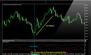
One main use of the RSI is to identify market extremes. Oversold TerritoryIf the RSI is below 30, this is the oversold territory. Selling pressure is high and a technical correction is likely. Prices are forming a bottom since there are no more sellers and therefore buyers begin to come into the market. Prices eventually head back up. If the RSI indicator turns up as well, then this is a good opportunity to buy. Remember that just because the RSI falls below 30, it does not mean it is a signal for immediate buying because the RSI may stay in the oversold territory for a long time. In order to enter at the right moment (on true market reversal) you should wait for the RSI to leave the oversold territory. Look at the chart below. When the RSI goes below 30, you would be on the lookout for an opportunity to buy, however your actual trade will take place only when the RSI crosses up above 30.
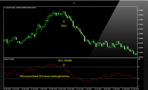
Overbought TerritoryIf the RSI is above 70, this is overbought territory. Buying pressure is high, and prices will form a top. Fewer buyers remain in the market and sellers begin to come in. A correction is likely, turning prices back down. If the RSI turns down as well, this is a good opportunity to sell.
Note Before Trading:Once the RSI goes above 70, you should wait for the indicator to come out of the overbought area and cross below 70 before placing your sell order. Look at the chart below.
To Confirm a Trend
The RSI indicator can be used to confirm the trend of the market.One way to do this is to draw trend lines on the RSI indicator. If the RSI’s trend line stays intact, it confirms that a trend holds well. RSI trend lines are especially useful on larger time frames. Look at the chart below. With the RSI trend lines you are able to receive a much earlier warning about upcoming trend changes since RSI trend lines will often warn of a breakout a few candles earlier than chart trend lines. Some technical analysts like to use the 50 level of the RSI for additional confirmation of a trend. If we see prices are in an uptrend on the chart, we can confirm this trend by looking at the RSI. If the RSI crosses above the 50 level from below, the uptrend is confirmed. On the other hand, if prices are in a downtrend on the chart and the RSI breaks below the 50 mark from above, we can confirm the downtrend. Referring to the chart below, we insert a 50 line in the RSI indicator section (see the red line).
To Identify Divergence
Another way to use the RSI indicator to help us trade better is to identify RSI divergence signals. What is divergence? Sometimes the RSI indicator will not move in the same direction as the market. This is what is called divergence. It is useful for informing us of an impending trend reversal and giving us the opportunity to enter a trade. We can identify bullish and bearish divergence.
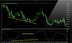
Bullish divergence occurs when the market is in a downtrend and prices are making a new low but the RSI does not continue lower and instead begins to climb back up. This is a bullish signal indicating that the trend is about to change direction to an uptrend. This gives us the opportunity to buy.
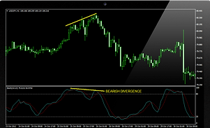
Bearish divergence occurs when the market is in an uptrend and prices are making new highs but the RSI does not continue higher. Instead the RSI turns down. This is a bearish signal indicating that the trend is about to change direction and become a downtrend. This gives us the opportunity to sell.
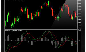
Moving Average Convergence Divergence (MACD)
The MACD is a popular oscillator used in technical analysis to identify trends and it stands for Moving Average Convergence Divergence. The MACD technique uses two exponential moving averages and its main purpose is to provide a smooth trend indicator. It is constructed by subtracting a 26-period exponential moving average (EMA) of the closing price from a 12-period EMA of the closing price:
MACD = EMA(12)-EMA(26)
Therefore, this difference between the two EMAs is plotted as a line on a chart, called the MACD line.
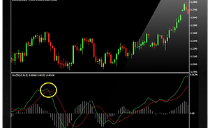
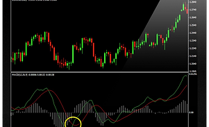
A second line called the signal line is then plotted and is basically a 9 period simple moving average of the MACD line. This is a slower line and basically smoothens out the faster MACD line, making it more accurate. The two MACD lines can be turned into a histogram which looks like vertical bars. This histogram can then be constructed by calculating the difference between the MACD and the signal line. If you look at the chart below, you can see that as the two moving averages separate, the histogram gets bigger. This is called divergence. On the other hand, as the histogram bars get closer, this means the moving averages get closer to each other, meaning they are converging and creating convergence. This is how the oscillator gets its name Moving Average Convergence Divergence!
The MACD is best used when there is a trend and it can give you buy and sell signals. The MACD indicator fluctuates over a zero line. It is the crossing of this line that generates buy and sell signals. Note how the histogram crosses over above or below the zero line coinciding with the crossings of the MACD line and its signal. The histogram can be used to identify the strength of the trend.
Bullish Market
When the MACD line is above zero, it means 12EMA is above 26EMA, and we can say the market is bullish. Buy signals are more profitable in an uptrend. Referring to the diagram, we can enter a buy position when the green line (MACD) crosses its signal (red line) from below and we can see that the trend is up.
Bearish Market
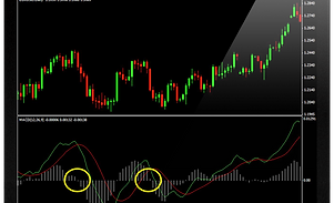
Sell signals of the MACD work best when the market is in a downtrend. When the MACD line is below zero, the 12 EMA is below 26EMA, we can say the market is considered bearish. We can enter a sell position when MACD crosses below its signal line from above and prices are moving down.
In the chart below, this happens when the MACD line (green line) crosses its signal line (red line) from above to move below it.
Trading with the MACD Histogram
The histogram can be used to identify the strength of the trend. When the histogram is above the zero line but is falling towards the zero line, we can say the uptrend is weakening and prices are beginning to fall. Also, when the MACD line is too far above the zero line we have an overbought condition. Likewise, when MACD is too far below the zero line, this suggests an oversold condition. Always determine the direction of the trend before entering a position. The MACD will help you time your entry.
The price ROC and the momentum indicators are similar oscillators and are interpreted in the same way since they both measure how fast prices change. They measure the velocity of price changes by measuring price difference and plotting this below the price chart. The only difference between the two indicators is that the ROC displays the rate of change in price as a percentage, whereas the momentum indicator displays the rate of change as a ratio.
Momentum is measured by calculating price difference for a fixed period of time. The formula used is the following:
M = V – Vn
V = Last Closing Price
Vn = Closing Price n Days Ago
For example, find the difference between the current closing price and the closing price of 10 days ago. Plot this value. The value is either positive or negative. If positive it is plotted above the zero line and means that the closing price is higher than that of 10 days ago, which is an indication that prices are moving higher. On the other hand, a negative value means that prices are below the zero line and are lower than the close 10 days ago. If the momentum is horizontal, this means that prices are only rising at the same rate they were rising 10 days ago (so no change, no acceleration).
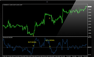
Look at the chart. If momentum is above the zero line, the prices are higher than 10 days ago. If momentum is rising, that means prices are going up, and are accelerating. A crossing above the zero line is a buy signal (the price trend must be up). A sell signal occurs when momentum crosses below the zero line (trend must be down). When momentum starts to turn down, even though the price on the chart is rising, we see a slowing down in momentum, in the trend. So the trend could be turning. That is why we can say that momentum leads the price action.
Extremes
You should know by all means that momentum does not have boundary extremes and it does not have a line indicating at which point the momentum indicator is at an extreme, you just have to eyeball it.
The stochastic is a momentum indicator that helps us identify a change in price direction and can also give us entry signals to buy or sell. This oscillator basically follows the speed or momentum of price and shows overbought and oversold conditions in the market. The stochastic indicator actually consists of two lines. The first line (often called %K) is the stochastic itself and the second line (called %D) is basically the moving average of the stochastic (the %K line). Don’t forget that on the MT4 trading platform the main %K line is displayed as a solid line and the %D is a dotted line. The stochastic indicator is plotted on a vertical scale between 0 and 100. A reading below 20 indicates an oversold condition whereas a reading above 80 indicates an overbought condition.
On the chart you can see that after the stochastic shows an oversold situation, prices go back up. After an overbought situation prices go back down.
Trading with Stochastics
An overbought condition suggests the possibility of an upcoming pause in a market rally, as buying pressure runs out of steam. So there is a greater potential for a reversal in price direction. Awareness of this situation can help us time a good selling opportunity. Conversely, an oversold condition suggests the possibility of an upcoming pause in a market decline as selling pressure runs out of steam and makes a reversal to the upside more likely. Awareness of this situation can help us time a good buying opportunity.
Divergence
Bullish and bearish divergence signals between price action and the stochastic oscillator are also helpful signals when anticipating market pauses and changes in price direction. A bearish divergence forms when a price records a higher high, but the stochastic oscillator forms a lower high. This shows less upside price momentum that could eventually lead to a downturn in prices. On the other hand, a bullish divergence forms when a price records a lower low, but the stochastic indicator forms a higher low. This shows less downside price momentum that could signal a reversal. Below we have an example of bullish divergence. Prices are falling but the stochastic is rising. Consequently, prices soon halt the downtrend and rise back up.
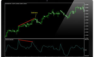
Commodity Channel Index (CCI)
The Commodity Channel Index (CCI) is an oscillator that compares current price with a moving average of a fixed number of days and then normalizes it by dividing it with a value based on a mean deviation. The CCI is useful to determine when an instrument has been overbought or oversold. It fluctuates between a range of +100 and -100. Typically when the CCI moves over 100 it is considered overbought, whereas under 100 is said to be oversold. Don’t let the name confuse you! The CCI Commodity Channel Index was originally created for use with commodities, but it is now also used with other
Just like other momentum oscillators, CCI usually leads price action and turns before prices at each extreme. It can warn you of an impending change in the direction of a price movement of an asset by identifying potential peaks and valleys in the price. By looking for divergence between price and CCI, you can find a good buy or sell signal. For example in the chart below, we see a negative divergence. CCI is declining while prices are still rising.